views
Drawing Basic Calligraphy
Learn the foundation of calligraphy. Calligraphy letters are drawn using thick and thin strokes to create shapes. They are not written like traditional letters. This ‘thick-and-thin’ effect creates a flowing, consistent pattern.Here are basic rules to follow: Keep the pen-angle constant Don't push too hard on the nib Draw parallel lines and even curves.
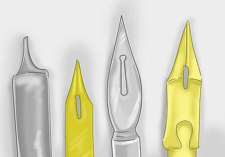
Get a variety of nibs. A ‘calligraphy nib’ refers to a pen tip that is broad and flat instead of a more commonly rounded point pen such as a fountain pen. This wide, flat structure allows the nib to create a unique ‘thick-and-thin’ effect which is what makes calligraphic letters look fancy. Nibs come in different widths, so having several will allow you to experiment.
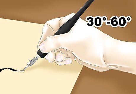
Hold your pen at a constant angle. It is important that you hold the pen so that the tip of the nib points away from you and to the left, at around 30° to 60°. The angle will vary depending on the specific script that you want to create, or naturally with the way you hold the pen.
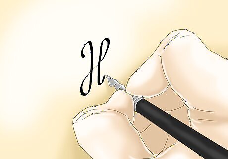
Maintain proper form. As you write, the nib should never turn to form lines and curves. The trick to creating beautiful, uniform calligraphy is to keep the point in the same direction. This is why you will have to pick your hand up to create several strokes that form each letter. Each stroke follows a pattern and shares similarities with other letters.
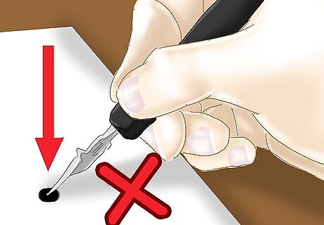
Do not press hard on the pen. Form each stroke by gently leading the nib across the paper. Your strokes will move backwards, forwards, and sideways from the direction the nib is pointing. Your hand, wrist, forearm, and elbow should not be touching the table. By fully supporting your hand and arm, it will help you keep a light pressure on the pen to help your strokes flow. You may damage the nib if you press too hard. If you lean on the pen, your letters may not flow, and your arm may get tired. By pushing the nib incorrectly, it may dig into the paper and blot. Always follow the strokes of calligraphy.
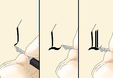
Draw vertical, horizontal and diagonal lines parallel with one another. Regardless of the specific type of calligraphy you draw, this same rule will follow. For example, italic calligraphy is created with lines that slope away upwards to the right, while Roman letters are drawn with perfectly vertical, straight-up-and-down lines.
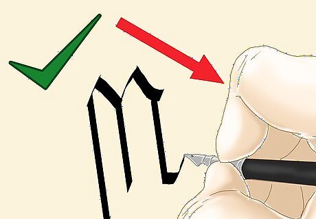
Beware of the different angles. Each skill focuses on the practice of accurate angles. Drawing lines that have the same angle as each other is just as important as keeping your pen-nib at a constant angle. If you draw lines at the correct angle, they won't look right if your pen is not kept at the correct angle. Never alter your pen angle for different line strokes. As you form each letter, you will constantly be picking the pen up from the paper to start new lines. To keep your pen angle accurate, do not move the pen from your fingers before finishing a letter, and do not twist the pen around between your fingers.
Drawing "Blackletter" Font Calligraphy
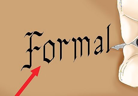
Use blackletter calligraphy for a formal look. This style is characterized by densely packed, angular letter forms, and a uniform style of vertical strokes. Blackletter font may be best used to express the wonder and fear on book covers, posters, records, or film titles. They could also express seriousness on diplomas or award certificates.
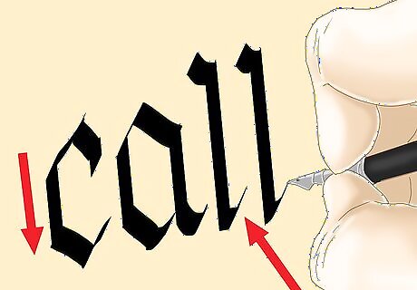
Notice the similarities between blackletter calligraphy letters. This style is best known for being dense and having angular letter-forms. The letters share many shapes to create a uniform and flowing piece of work. Here are important skills to use: Keep the pen angle at 30° to 45° Draw straight vertical lines Draw short, diagonal lines for decorative tails Use small, controlled movements Create a flow and a rhythm among the letters
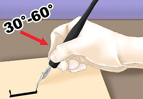
Hold your pen at a 30° angle. Although there will be a slight angle variation as you write, the angle will still add uniformity and character to the overall work.
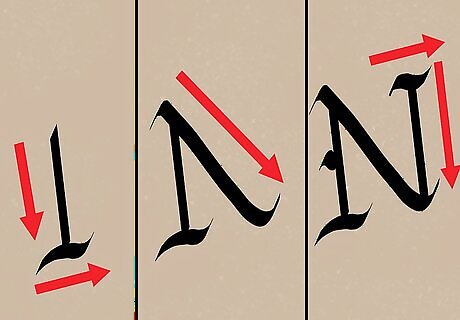
Use several strokes to form each letter. Instead of one fluid motion to form a letter, you will use two to four strokes to create each one that will form a pattern among the letters. Even though each letter is different, there are certain shapes that many of them have in common.
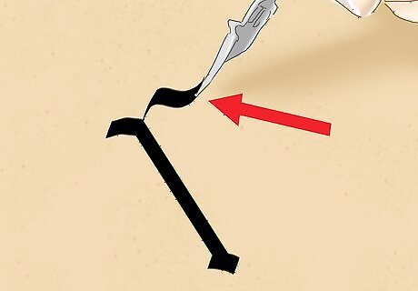
Design straight lines with a downward stroke. For h, m, n, r, and t, the first stroke will be the same. Hold your pen at a 30° angle, and make a straight line down and a sharp 45° tail up and to the right. The tail should be small with a sharp edge and not interfere with any part of the letter.
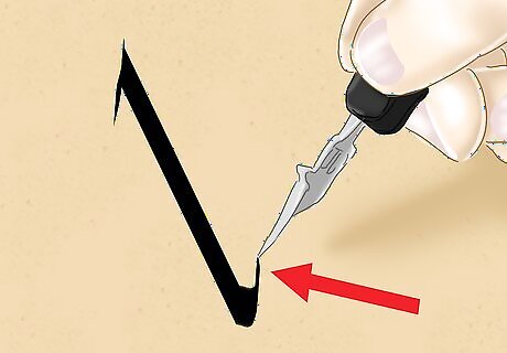
Make a straight line with a soft curve using a downward stroke. For b, d, l, u, and y, the first stroke will be the same. You will create a straight stroke downwards with a soft 45° tail that angles up and to the right. The curve should be more rounded than sharp.
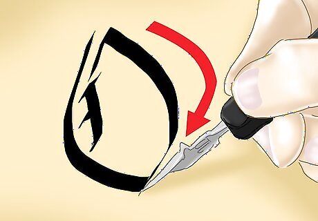
Form circular patterns with clockwise strokes. For b, c, d, e, o, p, g, and q, you will start from the top, and move right and down to form the top part of their circles. Once you reach halfway around the circle, pick up your pen, and start a new stroke that moves from the right and down to the left. End the circle when you reach the main vertical line.
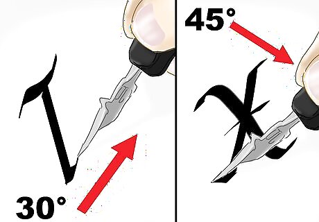
Watch your angles. Some tips and lines require softer, 30° angles, letters like k, v, w, and x all require 45° strokes. To make their downward lines, start at the top, and move either to the right or left being sure to move at a 45° angle. When you reach the bottom of the line, make an upward 30° curve.
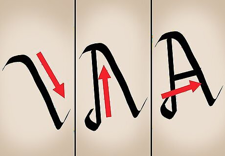
Create an "a" with three strokes. The "a" is unique, and it requires three separate motions. Hold your pen at a 45° angle. Create a tail at the top by moving to the right and up, and then make a line going down and to the right. Finish the stroke with a tail that curves up and to the right. Lift your pen, and make the bottom part of the circular pattern by moving from left to right, and stroking upwards. Move from right to left as you finish the top of the circle by starting at the first straight line, and finishing at the start of the second stroke.
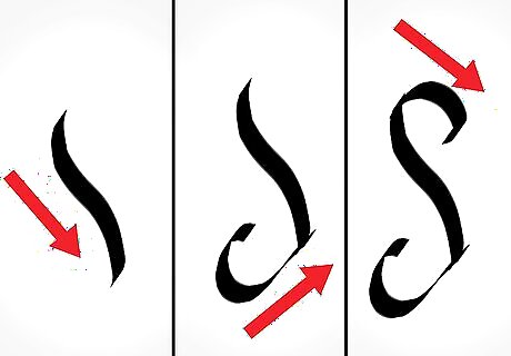
Create a "s" with three strokes. Make the middle of the "s" first by drawing a downward stroke from left to right. Create the bottom curve moving from left to right and wrapping upward to the bottom of the center line. Finish with the top moving from left to right, starting from the middle line and curving up and then, back down.
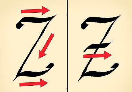
Draw a "z" with horizontal strokes. Horizontal strokes are made be moving left to right. To create the curvature of the "z", slightly curve up where you start and end. Remember to keep the angle of your pen consistent. Create the middle line by starting at the right end of the top horizontal line, and stroking down and to the right at a 45° angle. Finish the letter with another horizontal line that starts at the bottom tip of the middle line, and strokes to the right with an upward curl at the beginning and end. The two horizontal lines should have identical curves.
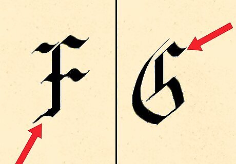
Pay attention to patterns. Although "g" and "f" have some different strokes, the main downward stroke with tail are the same. Start by moving your pen down, and create a small tail to the left. Do not finish the tail by moving your pen up. Pick up you pen, and start a new stroke that moves down and to the right. This stroke should meet the small tail of your first stroke.

Use these main strokes to create the alphabet. All letters in calligraphy follow the same basic strokes. Practice each letter using this guide so there is a uniformity among all of the letters.
Drawing Cursive Calligraphy
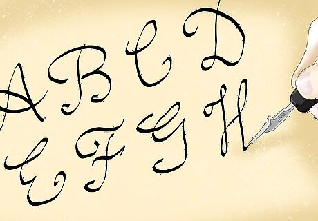
Notice the detail of cursive calligraphy. This style has many similarities to standard cursive. Most of the letters are made with just one stroke as cursive is meant to be done with efficiency. The main strokes to learn are downward, upward, and curve strokes.
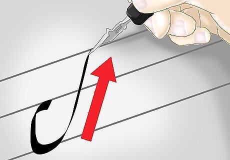
Use a basic upward stroke. Use lined paper, and start just above the bottom line. Curve down and to the right to the bottom line. When you touch the bottom line, stroke up to the top line moving from left to right.
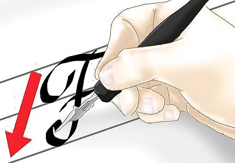
Learn the downward stroke. The letters b, f, h, i, j, k, l, m, n, p, r, s, t, u, v, w, x, y, and z all start with a downward stroke. Depending on the letter, you will have strokes that go to the top line, and some will only reach the middle line. The letter "f" will actually reach below the bottom line. These lines will flow from right to left.
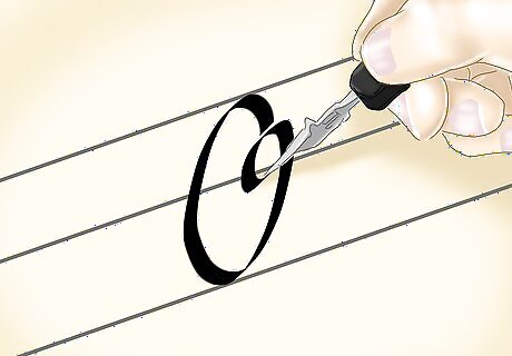
Practice the curve stroke with the letter "o". Put the tip of your pen right below the top line. Arc your pen down and around to the right, and bring the pen tip back to where you started. Finish the "O" with a curl to the right.
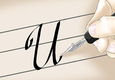
Try drawing a "u". Start with your pen tip on the bottom line. Draw an upward stroke to the middle line, and make a downward stroke that reaches to the bottom line and then, curves back up. Finish with another downward stroke and a small curl. Letters like i, j, m, n, r, v, w, and y have this stroke.
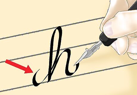
Draw the letter "h". Start with your pen tip on the bottom line, and stroke up to the top line. Then, arc your pen to the left, and draw a downward stroke to the bottom line so that you cross over your first line at the bottom. Make an upward stroke to the middle line, and another downward stroke back down to the bottom line finishing with an upward curl at the end. Letters like b, f, k, and l have similar strokes.
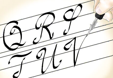
Try the other letters. Use a cursive calligraphy chart, and these stroke references, to guide you through the alphabet. Remember to keep your angles consistent, and resist the temptation to finish letters using the same, continuous stroke.
Choosing the Right Paper
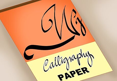
Use "sized" paper. Sizing refers treated paper that inhibits the absorption of ink to prevent it from bleeding This is the most common paper type for calligraphy because it helps to create clean, sharp lettering.
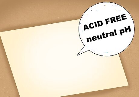
Choose acid free or neutral pH paper. Over time, wood pulp paper will begin to turn yellow and deteriorate. Acid-free or neutral pH paper is a treatment that neutralizes this problem and should be used for works that are meant to be kept for long periods of time.
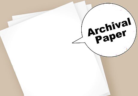
Try archival or “Rag” Paper. This type of paper is usually made from cotton or linen and has a neutral pH that will not yellow. Some papers and sketchbooks are labeled with “acid-free”, “archival” or “rag” and would be good to use for calligraphy.
Drawing Letters Free-Hand
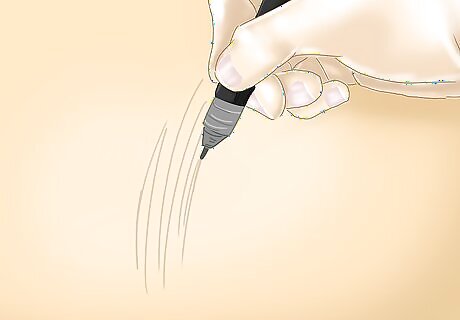
Use pencil first and mark lightly. You want to be able to fix any mistakes you may make, or make adjustments to your design. By using pencil, you will be able to easily erase and mark over what you draw.
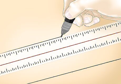
Use a ruler to create straight lines. Be sure to keep your lines parallel to the top and bottom of the paper. Try clipping your paper, or the material you are drawing on, to the table to keep it straight. This will help keep your letters straight.
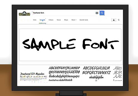
Look for a font you want to copy on your computer. You can use the fonts stored on your computer for inspiration, or you can search for fonts online. Once you find a font you want to use, keep it out if front of you as an example.
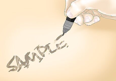
Begin drawing the letters. Go slowly, and try to be as accurate as possible. Remember to use a ruler when possible.
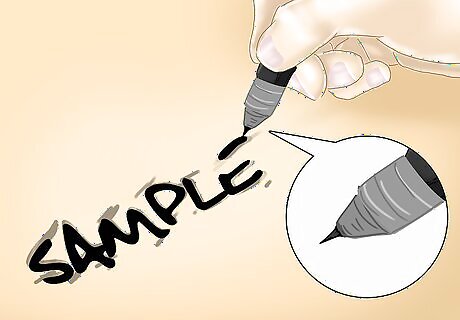
Trace over your pencil letters with a special pen. Using a pen with a finer point, or one that is made to glide smoothly, will help your letters turn out better. You can find special pens such as calligraphy pens online or at large convenience stores.
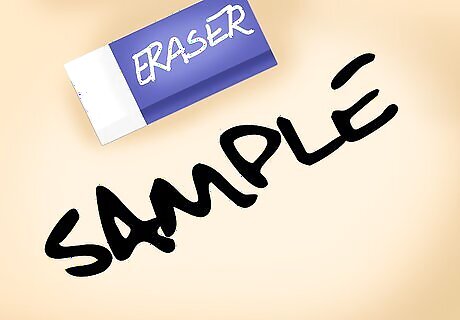
Erase any visible pencil lines. Gently go over the area, and make sure you do not smudge the your pen lines. Try waiting until the pen is completely dry before erasing your visible pencil lines.
Using an Italic Stencil
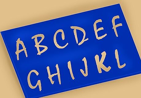
Purchase an italicized stencil. Stencils are a great way to ensure smooth and even lettering. There are many different types of italicized fonts to choose from.
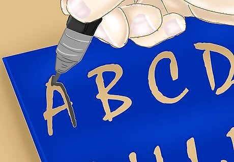
Trace your letters. The first step is to use a pencil to trace your letters. This way you can fix any errors or spacing issues. Once your letters look the way you want, trace over them with a good pen that is meant for fancy lettering. These pens offer finer tips and a smoother glide so your letters flow nicely.
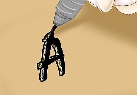
Design your letters. After you have traced out your letters, go back and add some creative design. You can add dots along the lines, draw curly designs that stem out from the letters, or add color. The design is up to you.


Comments
0 comment