views
Sketching it Out
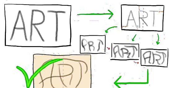
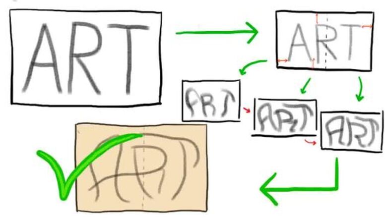
Write down the name in pencil or chalk. Write in print, rather than cursive, and use an erasable writing tool, since you'll need to manipulate the letters. Make it big, bold and clear. This will be the skeleton of the finished name . Here are some style elements to keep in mind: Think symmetry. You want your graffiti to be balanced and eye-catching. Play around with the letters so they fit together well; they don't have to be the same size. Mix up capital and lowercase letters to make them fit together nicely. The first and last letter should balance each other out. For example, if you're writing the name "JOSEPH," play with the "J" and the "H" to create a frame for the rest of the letters. You can add a hook to the second leg on the "h" so it matches the hook on the "J." A lot of graffiti artists write words in an arch, rather than a straight line, to give the design some extra punch.
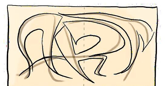
Turn the letters into blocks or bubbles. Draw around the original letters to create a larger 2-D sketch of the name. Block letters have straight lines and sharp corners, while bubble letters are more rounded; choose one or the other, but don't use both. Start thinking of the name as a work of art, rather than a written word. Make some bends in the straight lines. If you've got an "L," for example, you can make it look more artistic by bending both lines instead of keeping them boringly straight. Make the letters fit together like puzzle pieces. For example, in the name "KARLOS," you could tuck the "A" into the crook of the "K" and tuck the "O" into the corner of the "L."
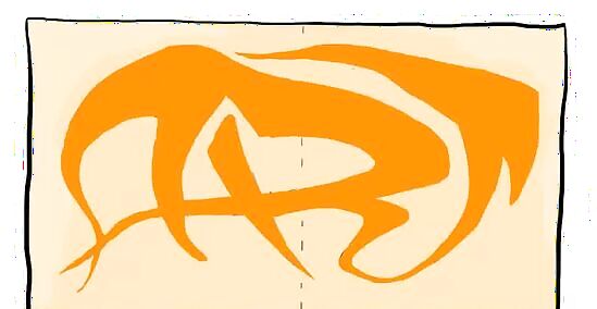
Connect some of the letters. Extend the block or bubble where one letter ends to the point where another begins, and erase the lines in between to connect them. This adds motion to the design and creates the illusion that the letters are flowing together. Don't necessarily connect letters that are right next to each other. In the word "SKYLAR," you might create a rectangular block that extends from the second leg of the "K" under the "Y" to connect with the "L." Take a look at your name and figure out which letters you could connect to make it more interesting. Make the original words you wrote your guide, not your prison. Don't be afraid to alter the letters beyond all recognition.
Adding Details
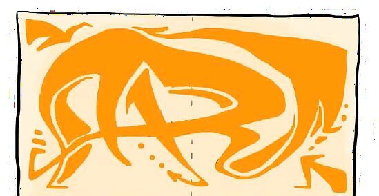
Add feet, seraphs, bits and arrows. Here's where you can get experimental and raise the name to a greater height. Adding your favorite flair is what sets your graffiti art apart from the rest. Feet, seraphs, bits and arrows are used to decorate the letters and add balance to the word. A foot is a blocky piece added to the bottom of a straight line. So if you've got an "E" with a bend in the bottom line, create a joint at the end of the line with a vertical line jutting up. A seraph is like a foot, but it juts from an upper line instead. On an "E" you'd add a seraph to the end of the top line. Bits are like blocky dots trailing off the end of a line. You can add them to any letter. Arrows also trail off the end of lines. A letter like "T" could have an arrow extending from the bottom line or either side of the top line.
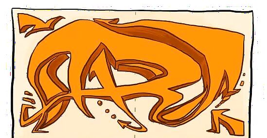
Create a 3-D effect. Add a shaded edge to your letters, then sharpen the lines to make the letters look 3-D. You could also approximate a 3-D effect by making the lines thicker and narrower at different places. For example, the top and one side of an "O" might be very thick, while the bottom and other side is narrowed.
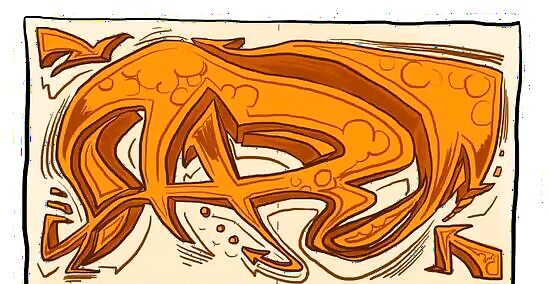
Include original elements. Once your letters are as you want them, you can add additional details if you choose to. Make them personal to your style and interests. Add a lightning bolt for the dot of an "i," or eyes peering out of the holes in your "B." The possibilities are limited only by your imagination.
Making it Pop
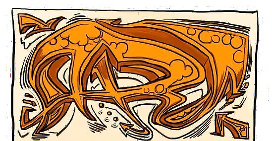
Blacken your sketch lines. Use marker or paint to darken the lines drawn with your pencil or chalk. Make bold, thick lines. This is graffiti, so it doesn't have to look nice and neat; the lines should be expressive. When you're done, erase any pencil or chalk lines skill peeking through.
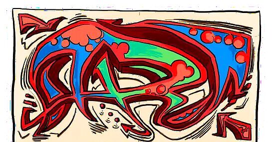
Add color. Fill all the letters in with just one color or experiment with lots of different hues. Graffiti artists traditionally had to work secretly for fear of getting caught - many still do - and so they could carry only one or two different colors of spray paint at a time - a lot of very good graffiti is just one color. If you want to try more than one, think about these options: You can do each letter in a different color or make the added details a different color than the letters. Try an ombre-style work of art with colors that gradually fade from one to the next. To create a sunset-like appearance, make the top part of the letters red, then blend that into orange, and fade into yellow at the bottom. For a bolder 3-D effect, color in the shaded edges of the letters with a darker color than the faces of the letters.
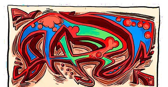
Set it against a background. Now that the name is complete, make it stand out by painting the background area a different color. If your name looks dark, paint a brighter background behind it; if it's light, set it against a dark color. Your work of graffiti art is sure to make people stop and stare.








Comments
0 comment