views
Learning about maps is an important part of the school curriculum. Students gather much information about a country by studying maps, including details about its climate, natural resources, landscapes, and water bodies. However, it is impossible for two-dimensional maps to show the actual size of countries. The sizes of each country are either too big or too small because the map does not use the same scale throughout. Recently, a social media user explained the matter in detail while taking a sly dig at schools for not providing a “proper world map.”
A video of the person demonstrating a world map was dropped on Instagram. “School = bs They can’t even teach you a proper world map. If they lie about that… what else are they lying about?” read the sarcastic caption.
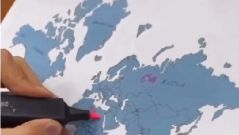
The clip began with a man displaying a 2D pictorial illustration of a world map saying that the measurements given were “wrong”. Pointing to Russia he explained that the country covers an area of 6,400 km. Coming to Africa, he circled the entire region on the map and revealed that the continent which looked half the size on paper was 7200 km long. “The continent of Africa has been shown to be smaller than it actually is,” he said.
View this post on Instagram
Moving on, the person shifted his attention to Greenland, highlighting a similar measurement discrepancy of making the territory appear larger on the map than it was. Soon after, he put up another world map on the table with a wholly different illustration, harbouring an accurate representation of each country. Calling it the “real map”, the man showed that countries like Finland, Norway, and Greenland were smaller in size than the ones depicted in common world maps.
Social media users reacted strongly to the post, with many claiming that it was not an unknown fact. “Am I the only one who paid attention in school? This is not new,” commented one individual. “This is because the projection used for this planisphere is made for NAVIGATION, it preserves the angles and a map with the real size of the continents would simply be unusable. It’s the Mercator’s projection,” explained another. “Earth is round. But the map is flat, so some adjustments need to be made. Simple as that,” wrote a third disappointed user.
The Mercator’s projection was first developed by Flemish geographer and cartographer Gerardus Mercator in 1569.


Comments
0 comment