views
Practicing Essential Techniques
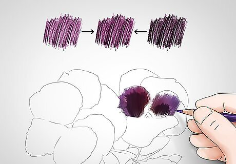
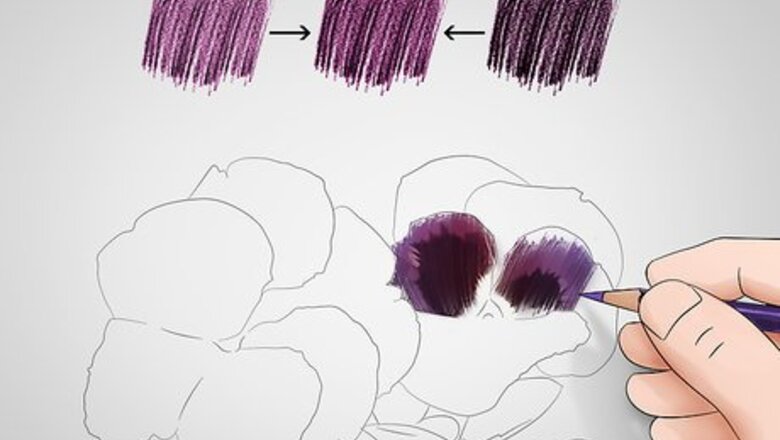
Layer colors to create texture and shape. Creating realistic images with colored pencils involves layering multiple colors on top of one another to generate accurate textures. Layering refers to the process of applying multiple colors on top of one another. To start layering, you’ll want to start with a base layer. Then, add additional layers of different colors on top to create shades, texture, or form. Using different techniques and experimenting with contrast while layering will prove to be an essential part of creating realistic images.
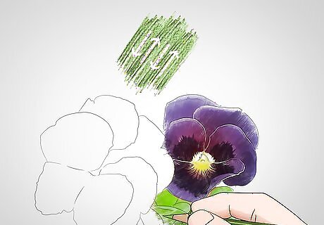
Use the back and forth stroke to evenly fill in color. Layering is most commonly done with the back and forth stroke. To use the back and forth stroke, angle your colored pencil towards your paper at 45 degrees and apply pressure evenly while drawing continuously over an area. Practice keeping each stroke relatively straight. This will keep your shading even and uniform. This is probably how you started drawing when you were younger. You just probably never knew the name for it! If you want to make certain areas darker while using the back and forth stroke, change the amount of pressure you’re applying to the paper.
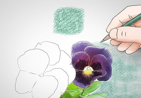
Try scumbling to fill in color in uneven patterns. Scumbling involves pressing the tip of your colored pencil into the paper and moving it around an area in uneven circles. This technique is typically used to layer a single color with another color in instances where you want to create uneven or jagged textures. The texture you create when scumbling changes based on the pressure you’re applying and on the size of circles that you’re creating. You can also scumble by using figure-eights to create a smoother texture. Similarly, you can scumble by using shaky lines to create a rougher texture.
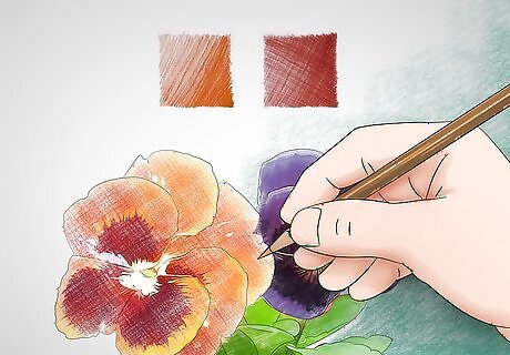
Use hatching and cross-hatching to create specific effects. Hatching involves drawing a sequence of parallel lines that are close to one another. Cross-hatching refers to two layers of hatching that rest on top of one another, typically at right angles. To use the hatching or cross-hatching technique, rapidly create straight lines by moving your whole wrist and lifting your pencil off of the page after each stroke. You typically want to keep your lines as straight as possible to ensure a uniform pattern. Hatching is often used to create unique forms and add volume to a shape.
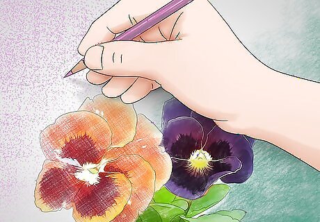
Try stippling to bring a unique consistency to a composition. Stippling is a technique used in art where you create an image by placing a lot of small dots next to one another. Stippling is one of the easier methods to use, since it only involves making a series of small dots with your pencil, but it can be rather time consuming. Stippling can be impressive because it adds a unique weight to each object in a drawing. Just keep in mind that it can take a long time if you’re using it to create an entire piece!
Creating Realistic Portraits
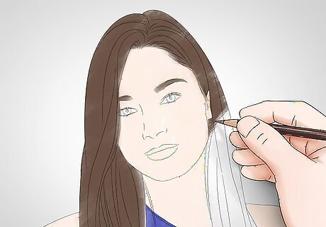
Apply a base layer to hair, skin, and key features. You’ll want to start by shading skin with a light flesh color, then move on to hair and clothing. Initial layers should be as flat and uniform as possible. Because colored pencils are transparent, you should still be able to make out any preliminary lines in your drawing underneath the initial layers. You probably want to use the back and forth technique for the initial layers since it’s the easiest way to fill in colors evenly. Start with the lightest colors first. It’s easier to make something darker with colored pencils, but it can be difficult to make something lighter without erasing anything.
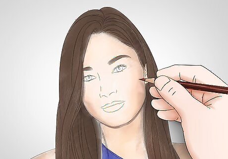
Begin to add texture and shape to the skin tones by adding layers. Using darker skin-tone colors like umber, cream, or burnt sienna, begin adding layers of color to the sections of the face that should be darker. This is where you’ll likely find yourself using cross-hatching, hatching, and scumbling to add new textures to the portrait. Pay close attention to the way light is hitting your subject. The darker areas of a face require more layers than lighter ones. Make sure that you’re not using the wrong technique to add texture to the hair. If your subject’s hair is curly, scumbling makes sense. But if it’s straight and flat, you probably want to use hatching.
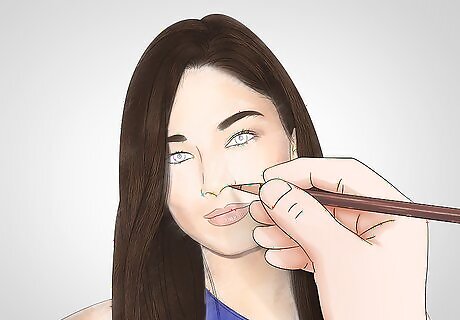
Determine the ranges of color needed for specific features. Once you’ve added initial layers to the hair and skin, you’ll want to add detail to specific features like the eyes, nose, and lips. Begin by selecting appropriate colors for each facial feature. When adding detail to facial features, apply color and shape to the necessary elements in careful increments. Pick appropriate techniques for each feature. Eyebrows are often created with hatching lines, while stippling is often used to add depth to the eyes.
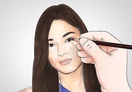
Make eyes pop by using a range of colors. Some features, like the eyes, often require several layers of varying colors. Brown eyes, for example, aren’t a single shade of brown. They're actually a complex range of lighter and darker shades of brown. In addition, you’ll want to leave a small round area in each eye where they catch light. The white of the eye isn’t actually white. It’s usually a thin shade of blue and red.
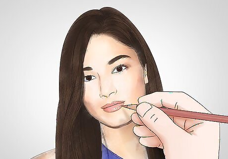
Style the lips carefully and slowly. Although they’re often a slightly different color from the rest of the face, lips usually aren’t bright red unless the person you’re drawing is wearing lipstick. Keep that in mind when looking for the proper colors to add. You’ll also want to make the top lip darker than the bottom one, since it angles downwards.
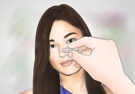
Highlight and blend features with an eraser. The colors in a realistic portrait should be well blended and contain strong highlights where the light hits. You’ll typically want to highlight sharper angles, like the bridge of the nose, and reflective surfaces, like the pupil. Using an eraser, lift small streaks of color off of the areas you hope to highlight in order to expose the paper underneath. You can use a white colored pencil if you’d like, but the highlight will be muddier and less vibrant. When using an eraser to blend, be careful about how much pressure you apply. This should be done sparingly and carefully.
Coloring Realistic Landscapes
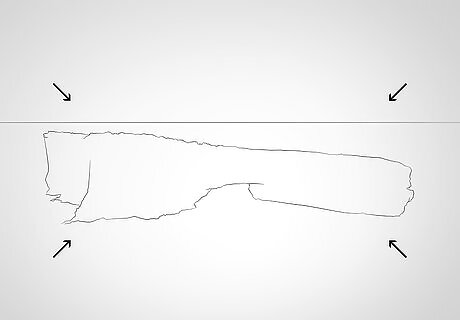
Find your composition’s focal point. Every drawing has a focal point, which is the main focus of a drawing. Determining the location of your focal point will let you know where to avoid layering colors in your background and give you more room to work with later on. To find your focal point, think about which object or area your eyes immediately focus on when looking at your drawing. Some illustrators prefer to start by adding color to the focal point, since your focal point will often have the most detail in your drawing.
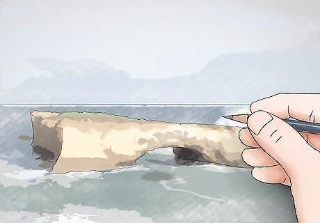
Start to fill in base layers of your background with lighter colors. Starting with your lightest shades, add initial layers of color to the bigger parts of your landscape. The sky is where a lot of people tend to start. Many artists use the back and forth method for large areas of sky, but may use hatching or scumbling for grass or clouds.
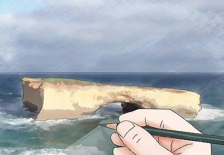
Layer darker colors with your background to create depth. Landscapes typically have a wide range of one or two colors (usually green and blue), which means that you’ll want to layer multiple shades to create the dynamic ranges that you’re looking for. Avoid applying color to objects in your foreground at first. This will help you later on when you add objects to your foreground. For skies, the darkest part of the drawing should likely be where the sky meets the horizon.
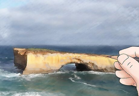
Add color to the objects in the foreground. Begin by layering base colors before moving on to more intricate details. Select your technique based on the object you’re drawing. A tree bark’s texture might require a mix of stippling and scumbling, while the side of a bare hill may only require some simple back and forth strokes. You don’t need to know what every single stroke is going to be. The key when layering colored pencils is to make layers of color the right size and texture to achieve a certain shape. The closer you are to the foreground, the more detail and value you want in your drawing.
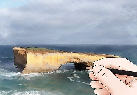
Use darker colors and apply pressure to create shadows. Keeping your source of light in mind, press firmly with darker colors to create shadows and add smaller details. Shadows don’t necessarily need to be black. For example, the shadow on a blade of grass is probably going to be a darker green.




Comments
0 comment