views
- Although the attribute for HTML to manage background color is gone, you can still use HTML with CSS to change your background color easily.
- You'll need a numeric code for the color you want if you want a specific color. If you don't need a specific color, you can use words like "orange" or "light blue."
- When editing a web page with HTML and CSS, you can create a solid background, gradient, or changing background.
Setting a Solid Background Color
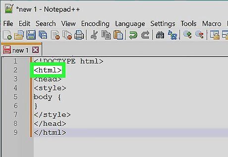
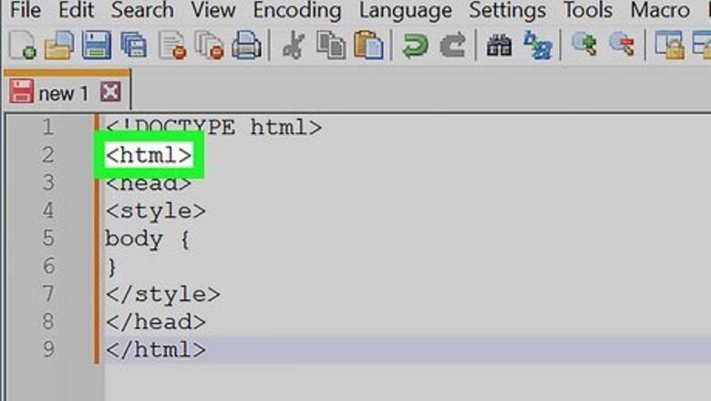
Find your document's "html" header. It should be near the top of the document.
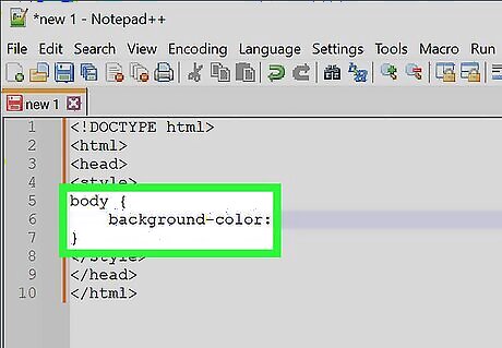
Add the "background-color" property to the "body" element. Type background-color: between the body brackets. You should now have the following "body" element: body { background-color: } In this context, only one spelling of "color" will work; you can't use "colour" here.
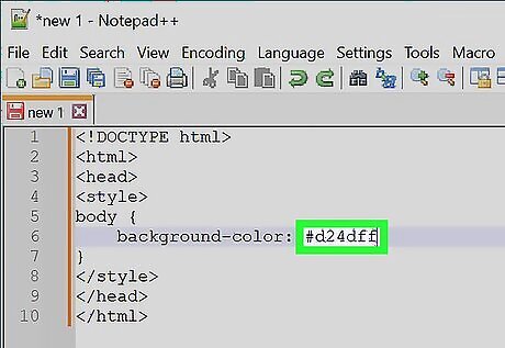
Add your desired background color to the "background-color" property. Type your selected color's numeric code followed by a semicolon next to the "background-color:" element to do so. For example, to set your page's background to pink, you would have the following: body { background-color: #d24dff; }
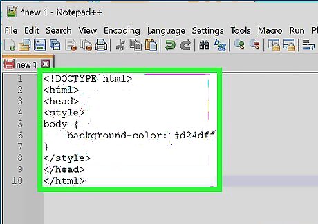
Review your "style" information. At this point, your HTML document's header should resemble the following:
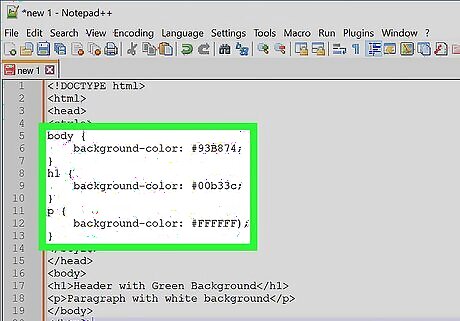
Use "background-color" to apply background colors to other elements. Just as you set it in the body element, you can use "background-color" to define the backgrounds of other elements such as headers, paragraphs, and so on. For example, to apply a background color to a main header (
) or a paragraph (
), you would have something resembling the following code:
Header with Green Background
Paragraph with white background
Creating a Gradient Background
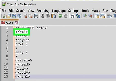
Find your document's "html" header. It should be near the top of the document.
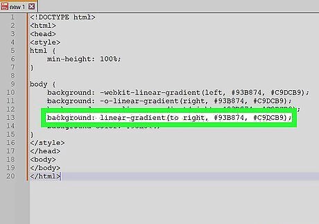
Understand the basic syntax of this process. When making a gradient, there are two pieces of information you'll need: the starting point/angle, and the colors that the gradient will transition between. You can select multiple colors to have the gradient move between all of them, and you can set a direction or angle for the gradient. background: linear-gradient(direction/angle, color1, color2, color3, etc); }}
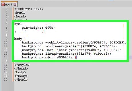
Make a vertical gradient. If you don't specify the direction, the gradient will go from top to bottom. To create your gradient, add the following code between the tags: html { min-height: 100%; } body { background: -webkit-linear-gradient(#93B874, #C9DCB9); background: -o-linear-gradient(#93B874, #C9DCB9); background: -moz-linear-gradient(#93B874, #C9DCB9); background: linear-gradient(#93B874, #C9DCB9); background-color: #93B874; } Different browsers have different implementations of the gradient function, so you'll have to include several versions of the code.
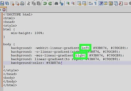
Make a directional gradient. If you'd rather create a gradient that isn't strictly vertical, you can add direction to the gradient in order to change the way the color shift appears. Do so by typing the following in between the tags: html { min-height: 100%;} body { background: -webkit-linear-gradient(left, #93B874, #C9DCB9); background: -o-linear-gradient(right, #93B874, #C9DCB9); background: -moz-linear-gradient(right, #93B874, #C9DCB9); background: linear-gradient(to right, #93B874, #C9DCB9); background-color: #93B874; } You can play around with the "left" and "right" tags to experiment with different directions for your gradient.

Use other properties to adjust the gradient. There's a lot more that you can do with gradients. For example, not only can you add more than two colors, you can also put a percentage after each one. This will allow you to set how much spacing you want each color segment to have. Here's a sample gradient that uses this principle: background: linear-gradient(#93B874 10%, #C9DCB9 70%, #000000 90%);
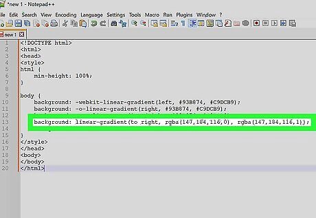
Add transparency to your colors. This will make the color fade. Use the same color to fade from the color to nothing. You'll need to use the rgba() function to define the color. The ending value determines the transparency: 0 for solid and 1 for transparent. background: linear-gradient(to right, rgba(147,184,116,0), rgba(147,184,116,1));
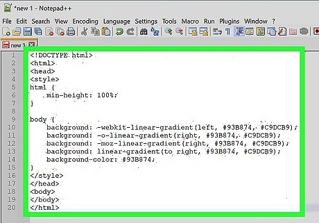
Review your completed code. The code to create a color gradient as your website's background will look something like this:
Creating a Changing Background
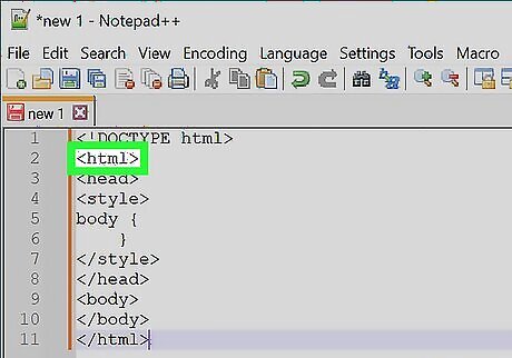
Find your document's "html" header. It should be near the top of the document.
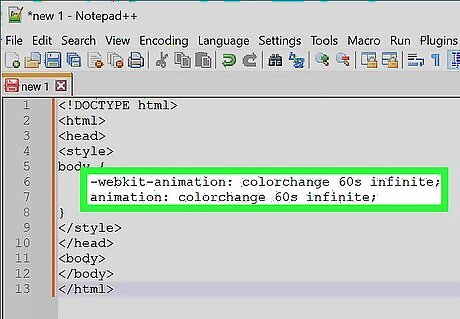
Add the animation property to the "body" element. Type the following into the space below the "body {" bracket and above the closing bracket: -webkit-animation: colorchange 60s infinite; animation: colorchange 60s infinite; The top line of text is for Chromium-based browsers while the bottom line of text is for other browsers.
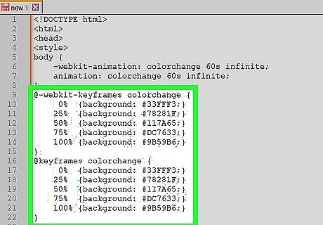
Add your colors to the animation. Now you'll use the @keyframes rule to set the background colors through which you'll cycle, as well as the length of time each color will appear on the page. Again, you'll need separate entries for the different sets of browsers. Enter the following lines of code below the closed "body" bracket: @-webkit-keyframes colorchange { 0% {background: #33FFF3;} 25% {background: #78281F;} 50% {background: #117A65;} 75% {background: #DC7633;} 100% {background: #9B59B6;} } @keyframes colorchange { 0% {background: #33FFF3;} 25% {background: #78281F;} 50% {background: #117A65;} 75% {background: #DC7633;} 100% {background: #9B59B6;} } Note that the two rules (@-webkit-keyframes and @keyframes have the same background colors and percentages. You'll want these to stay uniform so the experience is the same on all browsers. The percentages (0%, 25%, etc) are of the total animation length (60s). When the page loads, the background will be the color set at 0% (#33FFF3). Once the animation has played for 25% of of 60 seconds, the background will turn to #7821F, and so on. You can modify the times and colors to fit your desired outcome.
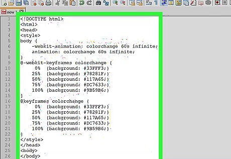
Review your code. Your entire code for the changing background color should resemble the following:


Comments
0 comment