views
- Go to the Insert tab and click "PivotTable" to create a new pivot table.
- Use the PivotTable Fields pane to arrange your variables by row, column, and value.
- Click the drop-down arrow next to fields in the pivot table to sort and filter.
Building the Pivot Table
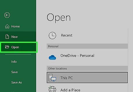
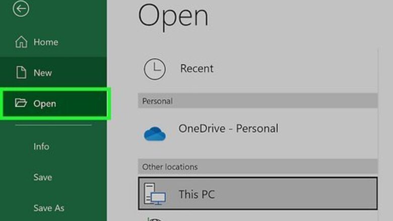
Open the Excel file where you want to create the pivot table. A pivot table allows you to create tabular reports of data in a spreadsheet. You can also perform calculations without having to input formulas. You can also create a pivot table in Excel using an outside data source, such as an Access database.
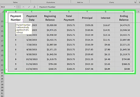
Highlight the cells you want to make into a pivot table. Note that the original spreadsheet data will be preserved. Skip this step if you're going to make the pivot table using an external source of data. Make sure your data is formatted correctly. To create a pivot table, you'll need a dataset that is organized in columns. It should have a single header row. Optionally, formatting your original data as a table using Insert > Table will help make sure the formatting is correct.
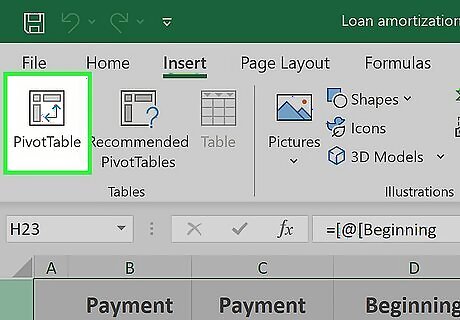
Go to the Insert tab and click PivotTable. This will open a new window for creating the pivot table. If you are using Excel 2003 or earlier, click the Data menu and select PivotTable and PivotChart Report. If you're using an external source of data, click the drop-down arrow under PivotTable and select From External Data Source. Then click Choose Connection in the new window.
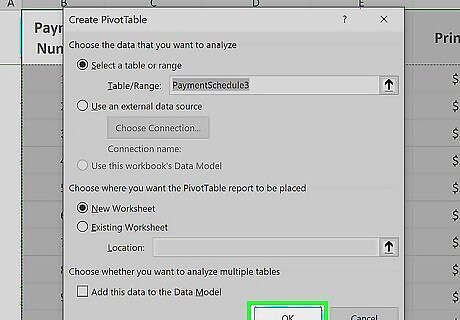
Select the location for your pivot table and click OK. This will place the new pivot table in the selected location. By default, Excel will place the table on a new worksheet, allowing you to switch back and forth by clicking the tabs at the bottom of the window. You can also choose to place the pivot table on the same sheet as the data, which allows you to pick the cell where you want it to be placed. You can later delete the pivot table without losing its data if needed.
Configuring the Pivot Table
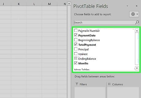
Click the checkbox next to fields you want in the PivotTables Fields pane. This adds the field to your pivot table. Note that fields are what Excel calls the variables in your dataset, based on the headers in the header row. Clicking the checkboxes automatically adds the field to a section of the pivot table. Non-numeric fields are placed in the rows section, dates are placed in the columns section, and numeric fields are placed in the values section. You can rearrange the fields by dragging them to a different section.
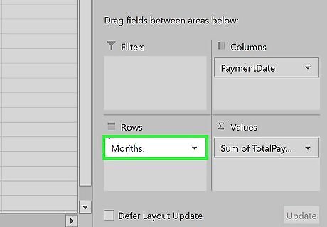
Add or move a row field. Drag a field from the field list on the right onto the "Row" section of the pivot table pane to add the field to your table. For example, your company sells two products: tables and chairs. You have a spreadsheet with the number (Sales) of each product (Product Type) sold in your five stores (Store). Drag the Store field from the field list into the Row Fields section of the pivot table. Your list of stores will appear, each as its own row.
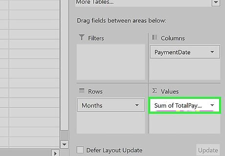
Add a value field. Drag a field from the field list on the right onto the "Values" section of the pivot table pane to add the field to your table. The values will be calculated and organized based on the rows and columns you select. Continuing our example: Click and drag the Sales field into the Value Fields section of the pivot table. You will see your table display the sales information for each of your stores.
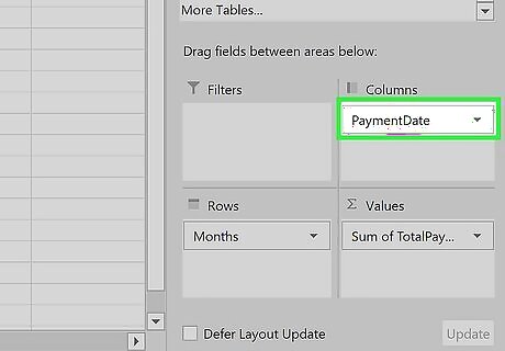
Add or move a column field. Drag a field from the field list on the right onto the "Column" section of the pivot table pane to add the column field to your table. This is used to separate your data by different categories or dates. Continuing our example, you could move Product Type to the columns section to see the product sales data for each store.
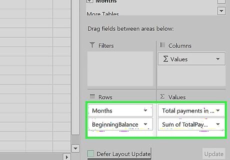
Add multiple fields to a section. Pivot tables allow you to add multiple fields to each section, displaying more information on the table or further subdividing the data. Using the above example, say you make several types of tables and several types of chairs. Your data notes whether the item is a table or chair (Product Type), but also the exact model of the table or chair sold (Model). Drag the Model field onto the Column Fields section. The columns will now display the breakdown of sales per model and overall type. You can change the order that these labels are displayed by clicking the arrow button next to the field in the boxes in the lower-right corner of the window. Select Move Up or Move Down to change the order.
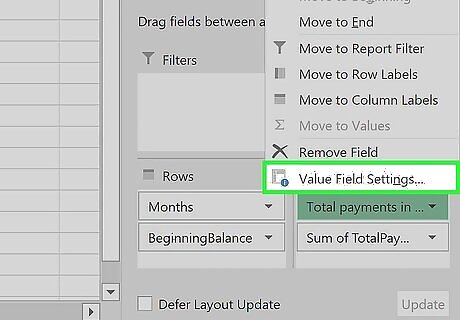
Change the way data is displayed. You can change the way values are displayed by following these steps: Click the arrow icon next to a value in the Values box. Select Value Field Settings to change the way the values are calculated. For example, you could display the average value instead of a sum. You can add the same field to the Value box multiple times to take advantage of this. In the above example, the sales total for each store is displayed. By adding the Sales field again, you can change the value settings to show the second Sales as a percentage of total sales.
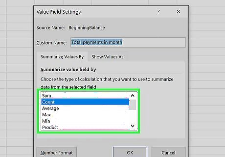
Learn some of the ways that values can be manipulated. When changing the ways values are calculated, you have several options to choose from depending on your needs. Sum - This is the default for value fields. Excel will total all of the values in the selected field. Count - This will count the number of cells that contain data in the selected field. Average - This will take the average of all of the values in the selected field.
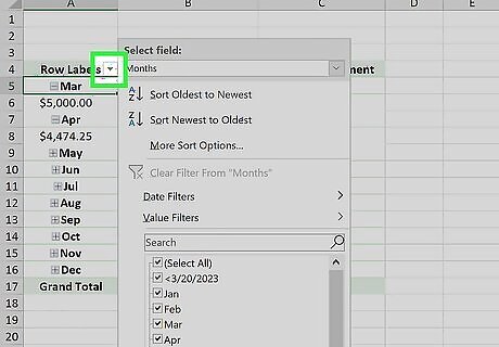
Click the drop-down arrow next to a field to add a filter and sort data. Note that this is next to the field header in the pivot table, not in the pivot table editor pane. Adding a filter allows you to display only certain data given the criteria you select. Sorting the data changes the order that it appears in the pivot table.
Using the Pivot Table
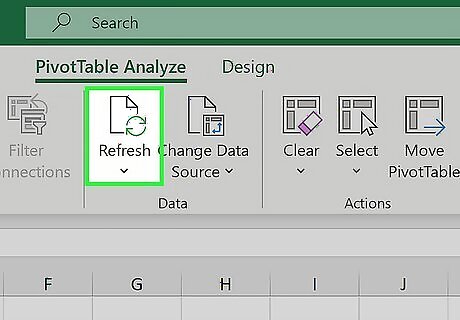
Update your pivot table. Your pivot table will automatically update as you modify the data in the spreadsheet. This can be great for monitoring your spreadsheets and tracking changes. You can also manually update the pivot table by clicking Refresh in the PivotTable Analyze tab.
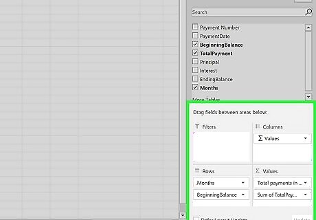
Change your pivot table around. Pivot tables are easy to edit using the editing pane. Try dragging different fields to different locations to come up with a pivot table that meets your exact needs. This is where the pivot table gets its name. Moving the data to different locations is known as "pivoting" as you are changing the direction that the data is displayed.
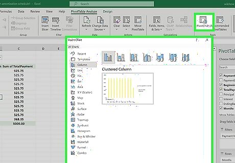
Create a pivot chart. You can use a pivot chart to show dynamic visual reports. Your Pivot Chart can be created directly from your completed pivot table. Click PivotChart in the "Tools" section of the PivotTable Analyze tab to make a pivot chart.


Comments
0 comment