
views
- You can design font characters using a vector design app like Adobe Illustrator or Inkscape and various font creation tools.
- Once you design your font letters, you can turn them into a font using font software like FontForge, Birdfont, FontLab, or Glyphs.
- The most common font file types are TrueType Font (.ttf) and OpenType Font (.otf).
Before You Begin

Think about the application of your font. Will your font be for a specific project (i.e., a logo, poster, album cover, storefront sign), or do you want to create a font that has a broad range of applications? This will help you decide how much time (and money) you want to spend creating a font. For example, if you are designing a logo for a death metal band, you may only need to create a handful of stylized characters. However, if you want to make a font for Adobe Fonts or Google Fonts, you may need to design hundreds of characters with unique styles and weights.
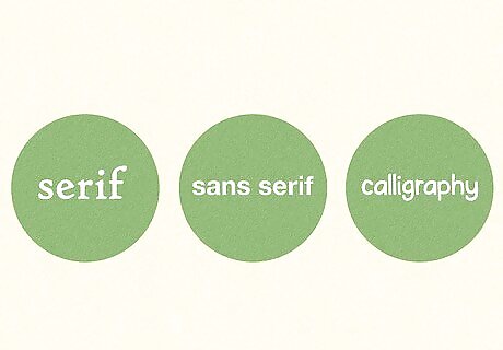
Decide which type of font you want to create. The two most common font types are serif and sans-serif. However, you can find more decorative fonts like brush, calligraphy, and black letter fonts. Serif fonts: Serif letters have decorative tapers or feet (called serifs) at their bases and tops of their letter stems. They are widely used in formal design and print publications, such as books and newspapers. Common serif fonts: Times New Roman, Garamond, Caslon, Baskerville, Courier New, and Georgia. Sans serif fonts: As the name implies, sans serif fonts lack serifs, and the letter thickness is usually consistent throughout the entire character form. These fonts look more modern and are used in many brand logos and digital publications, as they're easier to read on screens. Common sans serif fonts: Helvetica, Arial, Futura, and Calibri. Brush/calligraphy fonts: These fonts mimic human handwriting and look like they were written with a paintbrush or pen. They often use cursive (but not always) with connected letters and can be very formal, decorative, and fancy, or light and fun. Common brush fonts: Brush Script, Comic Sans, Lucida Handwriting, and Bradley Hand. Black letter fonts: These fonts tend to be ornate, with a medieval/gothic look, using thick letters with additional flairs and decorations. Common black letter fonts: Black Letter, Cloister Black, Old English, and Canterbury.
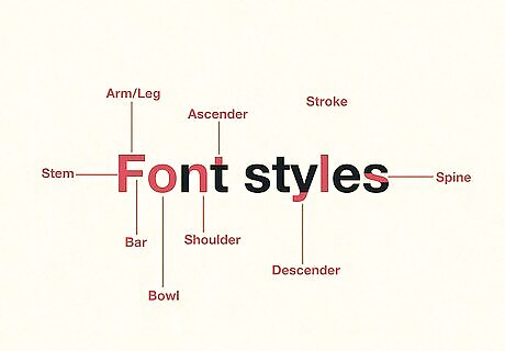
Understand the anatomy of a letter form. Letter forms have a variety of shapes and features that repeat throughout the entire font. You want to make sure these features stay consistent across your entire font. The following are some common characteristics you see in letter forms: Stem: The main vertical or diagonal stroke of a letter (i.e., the straight line in a capital "B" or the diagonal strokes in a capital "A."). Arm/Leg: A straight horizontal line attached to the stem at the top or bottom of the letter. The other end of the arm or leg is not attached to anything (i.e., the top and bottom lines in a capital "E.") Bar: The horizontal line in the center of letters like "A," "H," "e," or "f." Bowl: A curve that creates an enclosed space within a letter (i.e., the curved line in a lowercase "b" or an "o.") Counter: The enclosed space inside of the bowl of a letter. Ascender: The part of a lowercase letter that extends beyond the x-height of the lowercase letters (i.e., the long lines at the top of the letters "b," "d," "f," "h," "k," "l," and "t.") Descender: The line that extends below the baseline in lowercase letters (i.e., the line that extends below the letters "g," "j," "p," "q," and "y.") Shoulder: The curved line attached to the stem, such as the curved lines in the letters "h," "m," and "n.") Spine: The curved line in the center of an "S." Stroke: Any straight or curved line in a letter. Ear: A small stroke at the top of a lowercase "g." Loop: The lowercase portion of a lowercase "g." This can be a curve or a loop. Link: The stroke that connects the loop of a lowercase "g" to the top bowl. Stress: The direction of the line thickness in a serif font (i.e., draw a diagonal line through the thin part at the top of an "O" to the thin part at the bottom of the "O.") The slope of the line corresponds to the stress. Tail: The small stroke at the bottom of a capital "Q" or "R."
Designing the Font

Download font design software. Adobe Illustrator is the best software for designing letter forms. Illustrator is used to create vector graphics, which is what most fonts are made of. Vector graphics maintain the same clean and crisp look at any size. Fonts need to be able to look good at any size. You need a subscription to download Adobe Illustrator. You can download it from here If you don't want to pay for software, you can use Inkscape instead. Inkscape is an open-source and free vector graphics editor that will also work. You can download Inkscape from here Neither Adobe Illustrator nor Inkscape can save the font in a font file format, but they are both ideal for designing the shapes of your letters. If you don't want to use Illustrator or Inkscape, most font creation programs allow you to draw and edit characters within the app. The interface and tools may not be as strong or intuitive as Illustrator or Inkscape.
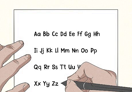
Draw your font on paper first. Before you start creating your letters in your design software, it's a good idea to start sketching your ideas on paper. Draw each letter multiple times. Decide what characteristics you want your font to have.
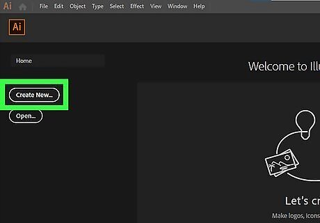
Create a new document for your font. Open Illustrator on Inkscape and create a new document. Make a square-shaped document. It doesn't have to be large. 350x350 pixels is a good size for most font-creation software.
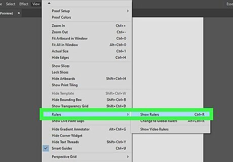
Create guidelines for your character heights. If you are using Illustrator, click View > Rulers > Show Rulers to make sure rulers are showing. On Inkscape, rulers are displayed by default. Click the ruler at the top and drag down to create a new guideline. Create a guideline for the following letter heights: Baseline: This is the line that the majority of your lowercase and capital letters will sit on. Cap Height: This is the maximum height of your capital letters. X-Height: This is the height of most lowercase letters that do not have an ascender. Ascender Height: This is the maximum height the ascenders on your lowercase letters reach. Descender Line: This line marks how far the descenders on your lowercase letters drop below the baseline. Letter widths: In addition to letter heights, you can also drag out guidelines from the ruler on the left side to mark the width of your letters. Keep in mind that lowercase letters may be thinner than capital letters, and some letters (such as an "O") may be wider than other letters (such as a "T").
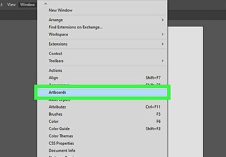
Create a new artboard for each letter. Decide how many letters your font needs. If you are just doing capital letters, you will need 26 artboards. If you are creating lowercase and capital letters, you will need 52 artboards. If you are doing capital, lowercase, numbers, and special characters, you may need as many as 80 artboards or more. To create a new artboard in Illustrator, click Window > Artboards to display the Artboards panel. Click the icon that looks like a blank page at the bottom of the Artboards panel to create a new artboard. If using Inkscape, use the Page tool to create a new page for each letter, or create a separate document for each letter.
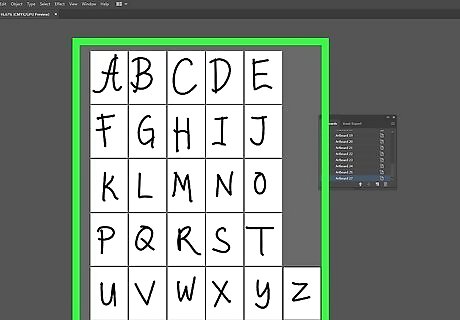
Start creating your letters. Use the guides to create a unique letter on each artboard. There are many ways you can do this. If you have a pen attachment, you can draw your letters by hand. You can also use the paintbrush tool or Pen tool to create complex shapes. Since fonts have repeating shapes, you may want to keep your stems, bowls, ascenders, descenders, serifs, shoulders, etc., separate shapes and keep them off the artboard. Copy and paste them and combine them into a single shape using the Pathfinder tool.
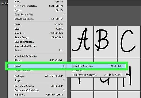
Save your letters as SVG files. Inkscape saves files as SVG files by default. You just need to select which page you want to save, click File > Save, and then save the letter. Be sure to create a folder for your font and save all the SVGs to that folder. Use the following steps to save your letters as SVG files in Illustrator: Click File. Click Export for Screens. Make sure all your artboards are selected. Enter a name for your font under "Suffex." Select "SVG" under "Format." Click Export Artboard.
Creating a Font File
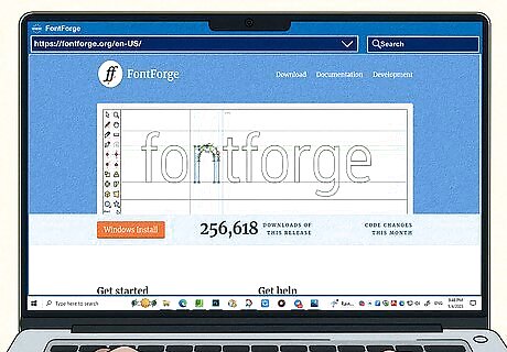
Download font software. There are several font applications you can use to create a font file. Some are free to use, and some are paid software. You can find a variety of font creation tools by searching the internet. Some popular options: FontForge: FontForge is an open-source and free font creation tool. It doesn't have the most intuitive interface, but it is a powerful and free tool for personal or commercial purposes. You can download FontForge from here. BirdFont: Birdfont is another program that is free to download for personal use. You can use it to create fonts using the SIL Open Fonts License for free. However, if you want to create a font for commercial purposes, you will need to purchase a commercial license. You can download BirdFont from here. Calligraphr: Calligraphr is a web-based tool that is great if you want to draw your font by hand. It lets you download a template to draw your characters by hand (or use it in Adobe Illustrator or Inkscape). Once you are done, you can upload the template with the completed characters and the web application will use that to create a font for you. You can get it here. FontLab: Fontlab is a paid font editor that's a great option if you want to create fonts professionally. It allows you to create fonts and import font files and images. You can try the basic font creation tool free for 30 days. Since FontLap is paid software, it has customer support. Get FontLab from here. Glyphs: Glyphs is another professional font editing program that's less expensive than FontLab and features many of the same creation tools and shortcuts as Adobe Illustrator. This software can create a full family of typefaces with different weights and styles. Since it is paid software, it is updated frequently and has customer support. A free 30 trial is available. Get Glyphs from here.
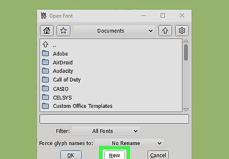
Create a new font file. The user interface for each font creation tool is going to be different. Generally, you can open a font or create a new font when you open the font creation application. Select the option to create a new font.
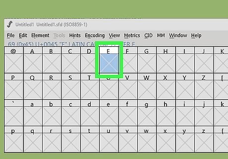
Select the letter you want to import or draw. Most font creation programs have a grid with all the characters you can create for your font. Double-click the grid space for the letter you want to draw or import.
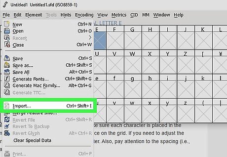
Import or draw the letter. You can either import an SVG file for that letter or use the creation tools to draw a letter. You can also use the creation tools to edit an SVG letter form after you import the SVG file. The interface is different between each program creation tool. You can generally find the option to import files in the File menu. Select the option to import a file. Then, select the option to import an SVG file. Select the SVG file for the character you want to create and import it. You will need to do this for each character in your font.
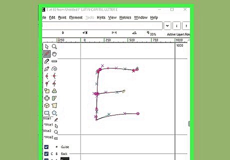
Make adjustments to the characters. Make sure each character is placed in the same position and size for each square space on the grid. If you need to adjust the letter form, use the creation tools to adjust the latter. Also, pay attention to the spacing (i.e., kerning and leading) between characters.
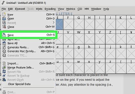
Save your font. You can generally find the option to save your font in the File menu. Select the option to save your font. Enter a name for your font and save it.
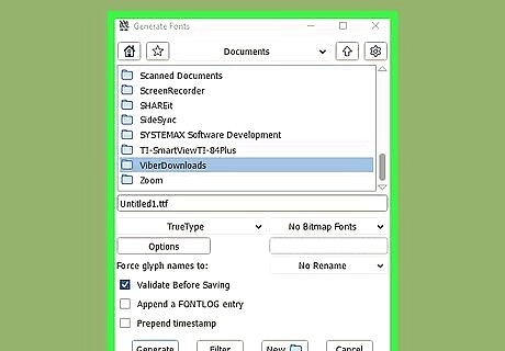
Export your font. Once you have a complete set of characters that you have saved, you can export your font. The option to do so is generally in the File menu. Select the option to export your font and select a font format you want to export it as. The most common formats are TrueType font (.ttf) and OpenType Font (.otf). Select a font type and export it.
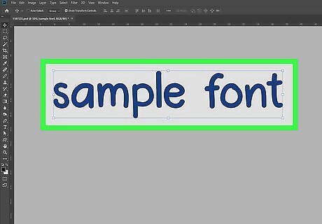
Test your font. After you create a font file, you will want to test it. Install the font on your computer and try it in various applications like Word, Illustrator, Photoshop, and more. See how the font looks as a title, sentence, and paragraph. Check the spacing between characters (kerning) and the space between lines (leading). Go back into your font creation program and make any necessary adjustments.
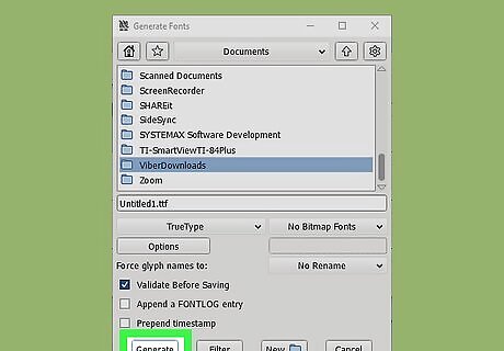
Export the final font file. Once you are happy with how the font looks, go ahead and save it and export the final font file. This will be the file you can distribute and use. You can use it for personal use (or commercial use if that's what you desire). You can even upload your font to a website using CSS.


Comments
0 comment