views
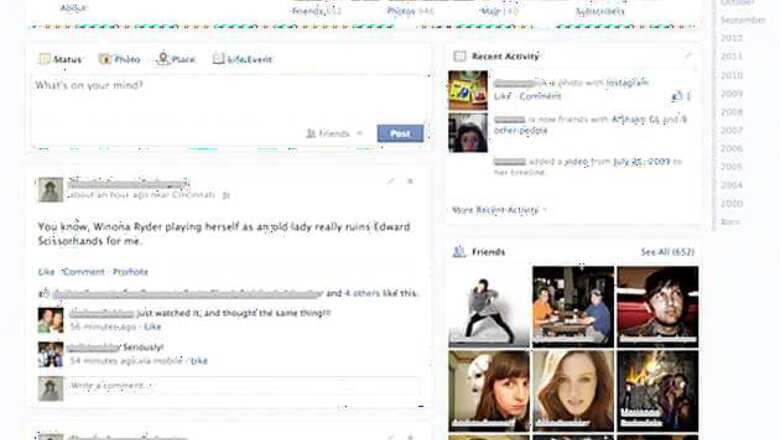
New Delhi: Facebook users upset with the two-column layout of the Facebook Timeline, may have some reason to cheer. According to Inside Facebook, the social networking service is testing a new design with a small percentage of users that has the posts in one column instead of the current format where posts are staggered in two columns.
There is also a narrower right column which displays activity modules. The timeline of dates, that is used to jump to any year or month on the Timeline, has been moved to a narrow strip to the right-most column.
In the new Timeline design the Facebook publishing widget and the posts appear much wider than in the current Timeline. Inside Facebook says that Facebook has confirmed that it is testing the design but did not offer any additional information.


Comments
0 comment